See that wall surrounding it? The owner at the time paid farmers $1.00 per rock they brought in for the wall. Quite a nice price for the times I would think (1911).
Although it is decorated and furnished in the style of the times (mostly, more on that later), almost all of the pictures I took were of the background:
The library ceiling.
The library ceiling in detail.
The dining room ceiling moulding...
...and in detail. Can you imagine trying to find an artisan that can still do this kind of work?
The serving room ceiling.
This picture does NOT do it justice. This is the dome stained glass ceiling of the conservatory. Hanging from the dome are glass clusters of grapes.
Details, details, details. The bowtie shape in the great hall floor...put there so the boards can't shift sideways. Where is this kind of workmanship any more?
The great hall ceiling. One of my son's favourite parts of the castle. This one was taken from the "Master Bedroom" balcony.
And, of course, random pieces of furniture that I liked:
The desk in the "Master Bedroom".
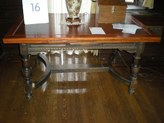
The bottom half of this table at the end of a hall.
The curved pieces between the legs on this little table. Nobody takes time for details like this any more. Sigh.
The trunk and little table in the only room that was labelled as the servant's room...more on that to follow.
Also in the servant's room.
It was built for entertaining military, business, and social contacts in grand style. Now, here's the thing - I spent the entire time that we were walking through it tryng to see it as it would have been, not as it is currently set up. When you enter, you are given a map, with the individual rooms labelled. On the third floor, I finally found the blueprints on the wall of what the rooms were when the house was in use. I so so would have liked to have seen it set up as the blueprints showed. The whole servants quarters were being used as offices and storage -except for the one room set up as a guest suite. Being a devoted follower of "Downton Abbey" and the new version of "Upstairs/Downstairs", I want to see the servant's quarters. Also, most of the family bedrooms have been set up as sitting rooms, more offices, and a war museum. In the basement, where the kitchen would have been - they have a gift shop and little cafe. I would really have enjoyed seeing the kitchen set up as it would have been back in the day. In fact, I think setting it up as it actually would have been would actually draw more tourists. But then, that's just my opinion.
Stay tuned for part two of our adventure...the art gallery.


Beautiful! I love Downton Abbey as well! Actually, I love everything old. It seems like everything was so well made way back when. Obviously it would have to be, considering it was meant to last. Unfortunately, we seem to have such a throw away culture these days! Can't wait to see more pictures!
ReplyDeleteI think I will start watching Upstairs Downstairs, I have seen several positive recommendations for it, maybe that is a sign :-)
What a beautiful house! You make a great point about having things set up as they would have been. If you ever make it down to North Carolina (US), there is a beautiful old house (almost a castle) called the Biltmore, built by the Vanderbilt family. I think they have kept it mostly as-is, although only a fraction of the rooms are open (it is HUGE). The gift shop, cafe, etc., are in surrounding buildings...it is kind of a village setting, and I had never thought about it before, but it does keep that kind of thing out of the house.
ReplyDelete